PowerPoint is probably one of the most criticized and underrated tools on the web, books have been written that talk about the damage that PowerPoint does to knowledge. It is associated with adjectives such as boring, ugly, excessively simple or too full of stimuli. But is PowerPoint’s fault in the use we give it? Or is it that the canvas is to blame for what is painted on it? In this article, I am going to tell you some powerpoint presentation tips to create educational content or e-Learning.
You will see that there are also things that you can use in presentations. You want to see an article that talks about maximizing PowerPoint for presentations here you have one. I love to focus specifically on the PowerPoint tricks that will allow you to define a coherent, personalized design. You can try Agile methods lead to e-learning success.
Powerpoint tricks for e-learning
-
CHANGE THE DEFAULT SIZE OF THE SLIDE
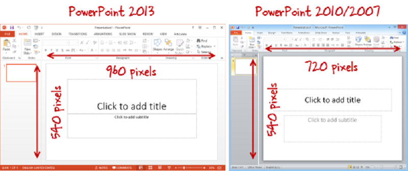
One of the simplest things that already makes a difference from other presentations or online courses that you have seen is the size of the slide. By default until PowerPoint 2010, the size corresponds to 4: 3 while in PowerPoint 2013 it is 16: 9. It is a more extended screen that adapts better to the most modern formats.
It is important that you apply this modification before adding any content to your slides, because if you add content first and then modify the size you may have problems with adapting the objects to the new dimensions of your document.
To modify it you must go to Design / Size of the slide and there you can select either the predefined sizes or access “Customize the size of the device”
-
CREATE YOUR OWN COLOR PALETTE
Create own palette. Once you have it, it’s time to integrate it into your PowerPoint designs with the “Customize colors “option. To do this you must go to Design / Variants / Colors / Customize colors:
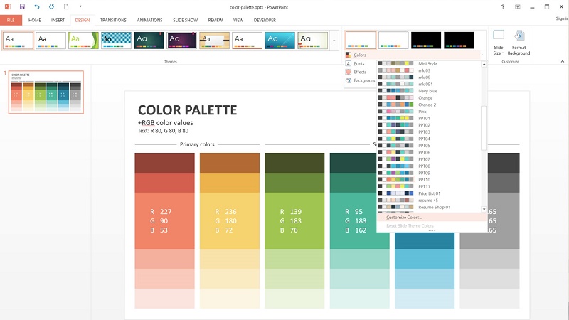
It will open a window like the one you see below, in each of the boxes you must indicate what the colors that your template will have been. The normal thing is that you need the first six colors, so it is important that the selections and you have prepared the RGB codes of each one of them to integrate them in this window.
Do not forget to assign a name to your color palette, so you can have several at once and change them from presentation to presentation.
-
SELECT THE SOURCES YOU WILL USE
Like the colors, the sources of an online presentation or course must be chosen carefully since they have a very important impact on the appearance of your document.
To create your own selection of fonts you must go to Design / Variants / Fonts / Customize fonts:
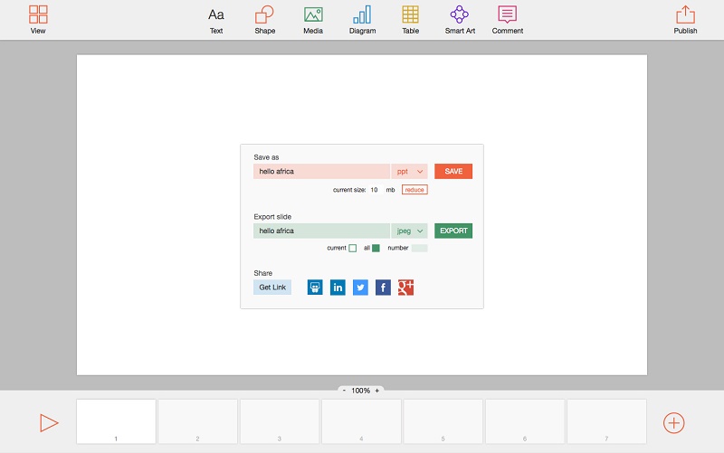
By default PowerPoint allows you to work with two sources, one for headings or titles and another for the body of the document. However, I recommend you have a third source that can be used to highlight short texts or give navigation instructions.
-
EMBED THE FONTS IN YOUR PRESENTATION
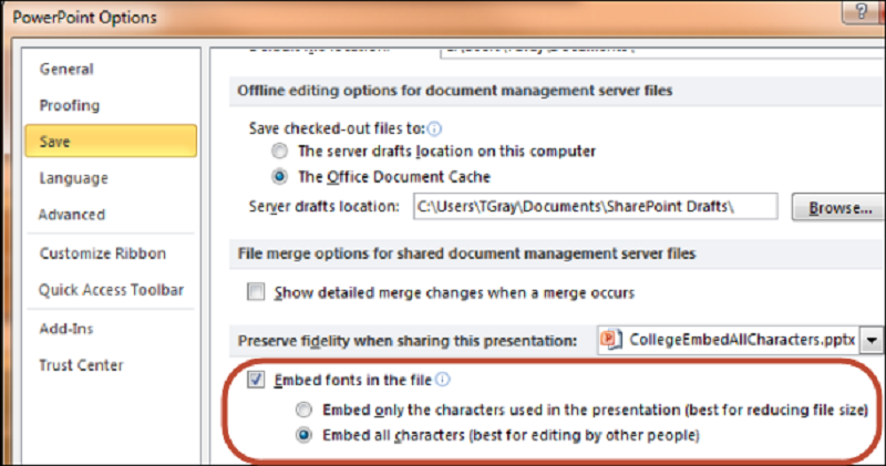
When you use fonts that do not come by default in Windows (for example, if you download them from Google Fonts ) it will happen that you will not be able to see your document correctly from other computers since the fonts must be installed in order for the PowerPoint document to recognize them. Otherwise, what it will do is look for similar sources, but normal and that will not stick with the design you have defined.
What is the solution? Embed the sources in the document, this way it will not matter if the sources are not installed in another computer since the same file will be placed.
To do this you must go to File / Options / Save / Embed fonts in the file
You must bear in mind that this implies that your file will have a greater weight and that surely you will have to compress it if you want to send it by email.
-
DESIGN YOUR SLIDE MASTER
This is one of the functionalities of PowerPoint that every e-Learning developer appreciates, since it allows to create a content structure or scenario using shapes, images, colors, and sources to later add the contents without having to repeat this structure or scenario page after page and with the added advantage that any changes made to the slide pattern will affect all slides that use certain designs . In short, it is the design template that PowerPoint offers and that you can customize in many ways.
To access you must go to Vista / Slide Master:
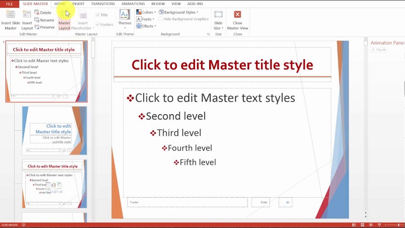
You will see a list with all the templates that come by default in PowerPoint (to a large extent, the bad reputation of PowerPoint lies in them: What I usually do with them is to eliminate them completely (except the one you are using).
In the slide pattern you can define, among other things:
The assignment of the sources that you have previously defined
Define the size and color of your sources for titles, subtitles, body, etc.
Bonus track: you can download the template that I used in this post if you subscribe to the newsletter; I also include the sources and sizes to develop Ipad and Youtube materials.
-
USE GRIDS AND ALIGNMENT
Alignment is one of the 4 basic principles of design and PowerPoint makes it easy to apply it in your documents. You can apply it in several ways; here I mention two of them:
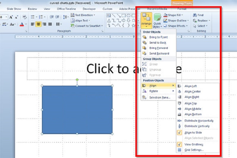
Use the grid lines: with the menu View / Gridlines, you will precisely display a grid on your slide, which will help you to align the objects simply by dragging them on the same line or angle.
If you need more precision, I recommend you use the PowerPoint alignment tool. To do this, you have to select the objects you want to align (holding the Shift key) and then go to Start / organize/align and select the alignment you want. In the following example the objects have been aligned to the left:
This is one of the best design tools that PowerPoint has since it not only allows you to align but also distribute a series of elements along the same line.
-
ADD SECTIONS TO YOUR PRESENTATION
This option allows you to structure a presentation in sections or chapters or lessons, or whatever you want to call it.
It is an excellent option to organize your information and it is also recommended that you divide your content into several sections so that each pill is rather short and so users keep their attention on them.
To use it you must go to Start / Section / Add section:
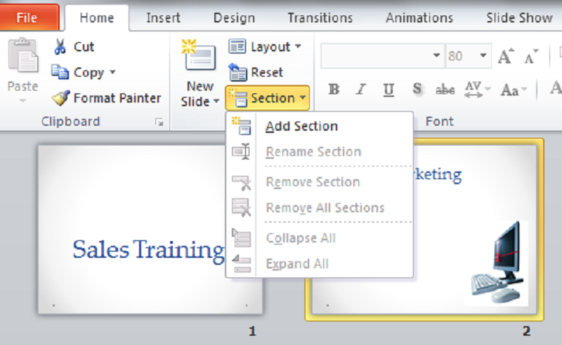
In this example, I have created two sections, “Introduction” and “Concepts.” To add pages to each section, you simply have to position yourself on the slide and with the right button select “New Slide”
-
COPY FORMAT
This is a trick I learned from outside the device to make it easier to copy their format in objects that are inside the slide.
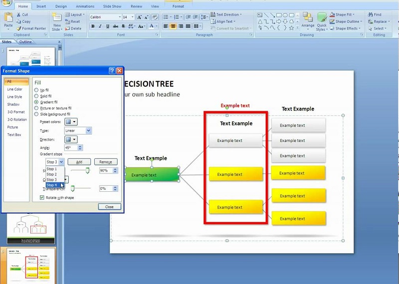
In the following screenshot, you will see that there are 6 objects to the left of the slide (a numbered circle, a box with dotted borders, a dotted line, a text in orange, a box with a black background and another with a red background). Meanwhile, on the slide, there are contents that do not have the format that I have established for my project since I have copied and pasted it from other sources (for example from a Word file or from the web).
To copy a format, you must first select the model object, that is, the object from which you want to replicate its format. In this case, the object selected is the box with a black background “Highlight”. You will see that the “Copy Format” menu is activated; you must click on it and then click on the object that you want to inherit the format of the one you initially selected:
As you can see in the following screenshot, the different objects of the slide have acquired the formats of the objects on the left, using the ” Copy Format ” command
-
INSERT AND ANIMATE GRAPHICS
This functionality is very useful to add animation in a simple way to the graphics that you use in your presentations or courses.
To begin, you must add a graphic in the Insert / Graphics menu and in the next window you must select the type of graphic you want to show:
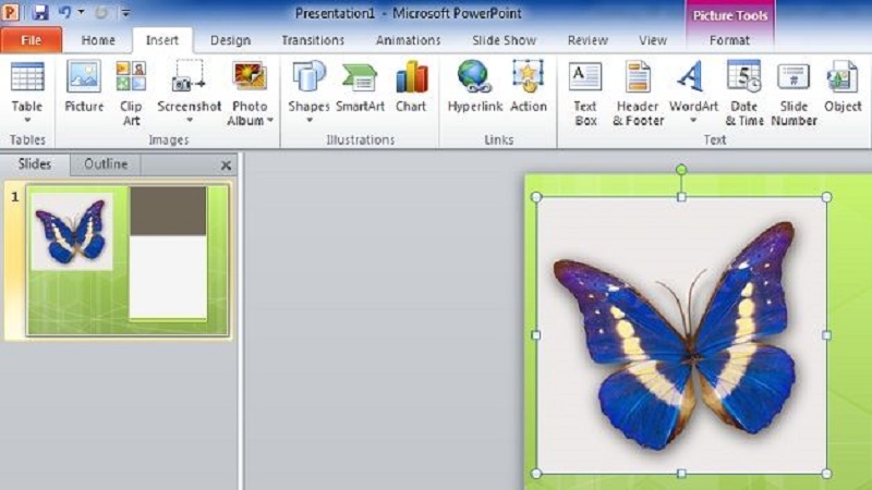
After adding the data you deem appropriate, you will select the graphics and go to the Animations menu, where you must choose any of the available input animations.
You will see that once you add an animation, a new tool is activated, “Effects options” where you must select “By categories “:
Finally, you will see that there is no longer a single animation but the graphic has been divided into several different objects that you can animate as you want:
-
CREATE A VIDEO OF YOUR PRESENTATION
Once you have created your presentation or course, you will want to see it as a spectator and analyze its strengths and weaknesses. To do this PowerPoint allows you to export your presentation in video format, in this way you can evaluate it and add the changes you think are convenient.
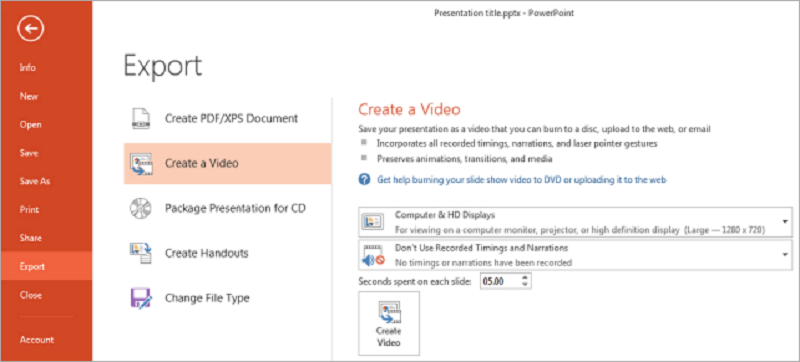
You can also upload it to YouTube and share it with your users. To save your presentation as a video you must go to File / Export and select “Create Video”
One of the most important advantages when applying these tricks is that if you work with authoring tools such as Articulate Studio, Captivate or iSpring you can easily and visually transform your PowerPoint content into training pills that you can insert into the LMS of your choice.
No, I have not forgotten the tricks to edit images, only for an entry is already good and that alone deserves a monograph, so if you want to be the first to receive it subscribe to the newsletter and I will notify you when I publish it. Did you know these tricks? Have I left any important outside?


